Earthy Neutrals and Warm Metallics: Elegant Color Trends for Your Home
Interior design trends come and go, but some combinations possess an enduring quality that transcends seasonal fads. The pairing of earthy neutrals with warm metallics represents one such timeless approach to home decoration. This color strategy has gained significant momentum among design professionals and homeowners alike, offering a perfect balance between natural comfort and refined sophistication.
The appeal of this color palette lies in its versatility and psychological impact. Earthy neutrals provide a calming foundation that connects inhabitants to nature, while warm metallics introduce elements of luxury and visual interest. Together, they create spaces that feel both welcoming and elevated, making them ideal for various home styles and personal preferences.
Understanding Earthy Neutral Colors
Earthy neutral colors draw inspiration from the natural world, encompassing the rich spectrum of tones found in soil, stone, wood, and organic materials. These colors possess an inherent warmth that distinguishes them from cooler neutrals like stark whites or cool grays. The earthy neutral family includes warm beiges, soft taupes, mushroom grays, sage greens, and muted browns.
The Psychology Behind Earthy Tones
Color psychology research indicates that earthy neutrals promote feelings of stability, security, and connection to nature. These colors activate the parasympathetic nervous system, which helps reduce stress and create a sense of calm. In residential spaces, this translates to environments that feel restorative and peaceful, essential qualities for modern living.
Unlike bright or bold colors that can become overwhelming over time, earthy neutrals provide a backdrop that remains comfortable and visually appealing long-term. This characteristic makes them particularly valuable for primary living areas where occupants spend significant amounts of time.
Popular Earthy Neutral Shades
| Color Name | Swatch | Description | Best Used In |
|---|---|---|---|
| Warm Beige | A creamy, inviting neutral with golden undertones | Living rooms, bedrooms | |
| Mushroom Gray | A sophisticated gray with brown undertones | Kitchens, offices | |
| Sage Green | A muted green reminiscent of dried herbs | Bathrooms, bedrooms | |
| Clay Brown | A rich brown inspired by terracotta | Dining rooms, accent walls | |
| Stone Gray | A neutral gray with subtle warm undertones | Entryways, hallways |
The Appeal of Warm Metallics
Warm metallics encompass metals with golden, copper, or bronze undertones, contrasting with cooler metallics like silver or chrome. The warm metallic family includes brushed gold, antique brass, copper, bronze, and rose gold. These finishes add depth, richness, and visual interest to neutral color schemes without overwhelming the overall aesthetic.
Types of Warm Metallic Finishes
Different warm metallic finishes offer varying levels of formality and visual impact. Brushed finishes provide a more subtle, contemporary look, while polished finishes create dramatic focal points. Antique or aged finishes introduce character and historical depth, making them ideal for traditional or transitional design styles.
The key to successfully incorporating warm metallics lies in understanding their undertones and selecting finishes that complement rather than compete with each other. Mixing multiple warm metallics can create rich, layered looks when done thoughtfully, but requires careful attention to balance and proportion.
Creating Harmonious Color Combinations
The success of earthy neutral and warm metallic combinations depends on understanding color relationships and proportions. The most effective approaches follow the 60-30-10 rule, where neutral colors comprise 60% of the color scheme, secondary colors account for 30%, and metallic accents provide the remaining 10%.
Foundation Colors
Establish the room’s foundation using earthy neutrals on large surfaces such as walls, flooring, and major furniture pieces. These colors should create a cohesive backdrop that allows warm metallics to shine without competing for attention. Consider the room’s natural light when selecting foundation colors, as north-facing rooms benefit from warmer neutrals while south-facing spaces can accommodate cooler variations.
Wall Color Selection
Choose wall colors that complement your room’s lighting conditions. Warm beiges and soft taupes work well in rooms with limited natural light, while sage greens and mushroom grays suit brighter spaces.
Flooring Considerations
Natural wood floors in honey or walnut tones provide perfect foundations for this color scheme. If replacing flooring isn’t possible, area rugs in complementary earthy tones can achieve similar results.
Furniture Integration
Select major furniture pieces in neutral upholstery that won’t date quickly. Linen, cotton, and wool fabrics in earthy tones provide texture while maintaining the color scheme’s integrity.
Texture Layering
Incorporate various textures through fabrics, natural materials, and finishes. Rough-hewn wood, smooth ceramics, and nubby textiles add visual interest within the neutral palette.
Metallic Accent Integration
Warm metallics should appear throughout the space in measured doses to create cohesion without overwhelming the neutral foundation. Strategic placement in lighting fixtures, hardware, decorative objects, and artwork ensures even distribution while maintaining visual balance.
Consider the finish consistency when incorporating multiple metallic elements. While mixing different warm metals can create rich, layered looks, maintaining similar undertones prevents the combination from appearing disjointed or accidental.
Room-by-Room Application
Different rooms present unique opportunities and challenges for implementing earthy neutral and warm metallic color schemes. Understanding each space’s functional requirements and aesthetic goals ensures successful color application across the entire home.
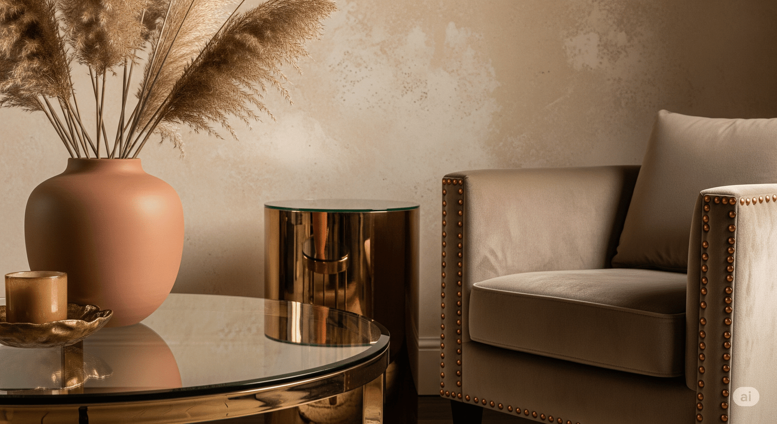
Use warm beige or soft taupe walls as the foundation. Incorporate copper or brass elements through lighting fixtures, coffee table accessories, and picture frames. Layer textures with linen upholstery and natural fiber rugs.
Pair mushroom gray cabinetry with brushed gold hardware and fixtures. Natural stone countertops in warm tones bridge the neutral and metallic elements while providing durability.
Create a serene retreat with sage green walls and antique brass accents. Layer bedding in various neutral tones and add warmth through copper table lamps or wall sconces.
Stone gray tiles provide a spa-like foundation for rose gold fixtures and accessories. Natural materials like wood vanities add warmth and texture to the space.
Living Spaces
Living rooms and family rooms benefit from this color combination’s versatility and timeless appeal. These high-traffic areas require colors that remain visually appealing over extended periods while accommodating various activities and lighting conditions throughout the day.
Consider incorporating warm metallics through permanent fixtures like ceiling fans, built-in shelving hardware, and fireplace accessories. These elements provide consistent metallic presence while allowing flexibility in decorative accents and seasonal changes.
Private Retreats
Bedrooms and bathrooms represent opportunities to create more intimate interpretations of the earthy neutral and warm metallic theme. These spaces can accommodate slightly deeper or more saturated neutral tones while maintaining the overall aesthetic direction.
In bedrooms, focus on creating layers of neutral tones through bedding, window treatments, and furniture finishes. Warm metallic accents in lighting and decorative objects add luxury without disrupting the restful atmosphere essential for quality sleep.
Seasonal Adaptations and Flexibility
One significant advantage of earthy neutral and warm metallic color schemes lies in their adaptability across seasons. The foundation colors provide stability while allowing for seasonal accent changes that keep spaces feeling fresh and current.
Spring Refreshing
Introduce fresh green plants and lighter textiles while maintaining the neutral-metallic foundation. Consider adding cream or ivory accents to brighten the overall palette.
Summer Lightening
Swap heavier fabrics for lighter linens and cottons. Incorporate natural materials like rattan or bamboo accessories to enhance the earthy connection.
Fall Warming
Deepen the neutral palette with richer browns and add copper accents. Layer warm textiles like wool throws and velvet pillows for increased coziness.
Winter Cozying
Emphasize warm undertones through lighting and textiles. Add bronze or brass candle holders and lanterns to create intimate, warm atmospheres.
Budget-Friendly Implementation Strategies
Achieving the earthy neutral and warm metallic look doesn’t require complete room renovations or expensive designer pieces. Strategic updates and thoughtful shopping can create significant visual impact while respecting budget constraints.
High-Impact, Low-Cost Changes
Paint represents the most cost-effective way to transform any space. A single accent wall in a rich earthy tone can dramatically alter a room’s character while requiring minimal investment. Similarly, updating hardware on existing cabinetry with warm metallic finishes provides instant sophistication.
- Paint Strategy: Focus on accent walls or architectural features rather than entire rooms to maximize impact while minimizing paint costs.
- Hardware Updates: Replace cabinet pulls, drawer knobs, and light switch plates with warm metallic alternatives for immediate transformation.
- Textile Layering: Incorporate the color scheme through throw pillows, blankets, and area rugs rather than replacing major furniture pieces.
- Lighting Upgrades: Swap lampshades or update light fixtures to introduce warm metallic elements throughout the space.
- Accessory Integration: Add picture frames, vases, and decorative objects in appropriate colors and finishes to complete the look.
Professional Designer Tip
Start with one room and perfect the color balance before expanding to additional spaces. This approach allows you to refine your technique and understand how different lighting conditions affect your chosen colors. According to Better Homes & Gardens, successful neutral schemes rely on understanding undertones and how they interact with natural and artificial light sources.
Current Design Trends and Future Outlook
The popularity of earthy neutrals and warm metallics aligns with broader design movements emphasizing sustainability, wellness, and connection to nature. These trends reflect growing awareness of design’s impact on mental health and environmental responsibility.
Biophilic Design Influence
Biophilic design principles, which seek to connect interior spaces with natural elements, strongly support the use of earthy neutral and warm metallic combinations. This design philosophy recognizes humans’ innate connection to nature and incorporates natural colors, materials, and forms into built environments.
Research from environmental psychology supports biophilic design’s positive effects on stress reduction, cognitive function, and overall well-being. As this research becomes more widely known, demand for nature-inspired color schemes continues growing among both designers and homeowners.
Sustainable Design Considerations
The longevity of earthy neutral and warm metallic color schemes aligns with sustainable design principles by reducing the need for frequent updates or replacements. Timeless color combinations discourage the wasteful cycle of constant redecorating while maintaining visual appeal over many years.
Additionally, many warm metallic finishes can be achieved through sustainable materials and processes. Reclaimed metals, low-VOC finishes, and responsibly sourced materials support both aesthetic and environmental goals.
Common Mistakes and How to Avoid Them
While earthy neutral and warm metallic combinations offer significant flexibility, certain pitfalls can undermine their effectiveness. Understanding these common mistakes helps ensure successful implementation of this sophisticated color approach.
Proportional Imbalances
One frequent error involves using too many metallic accents, which can make spaces feel gaudy or overwhelming. The key lies in restraint and strategic placement rather than abundant application. Remember that metallics should enhance, not dominate, the overall design scheme.
Conversely, insufficient metallic presence can result in spaces that feel flat or lacking in visual interest. Finding the right balance requires careful consideration of room size, lighting conditions, and existing furnishings.